The primary updates of note this week are look and feel updates to our login and subscription pages.
Here’s an example of your old login screen:

And, here is the new layout:

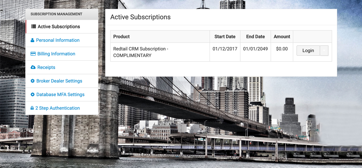
Similarly, here is an example of how your subscription page might have looked previously:

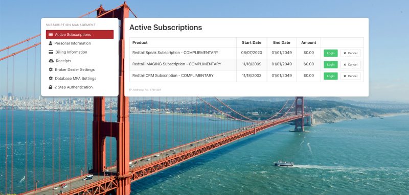
And, here’s how that subscription page might appear now:

Note: we’re not talking about the images used as backgrounds for any of these screens, as they rotate. The differences are in the white areas of the page: on the login pages this is where you enter your credentials and on the subscription pages this is where you’ll have access to your subscription links and information. What has been changed is that these white areas take up less screen real estate (so you can see more of the pretty backgrounds) and they have rounded corners (for aesthetic reasons).
We’re announcing these changes (rather than just simply pushing them out there) as we recognize that many users may notice the changes on their own and have questions about whether or not they have actually arrived on Redtail’s login page. So, this is just to say: “yes, you are in the correct place, and as always we are glad you are here!”


